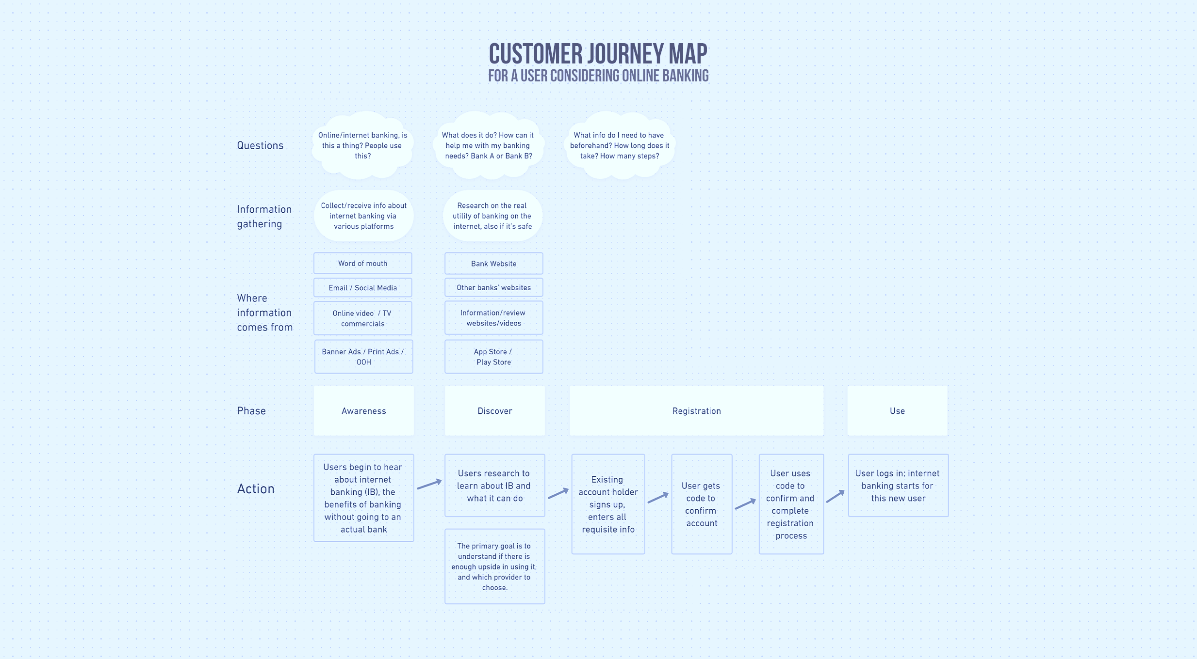
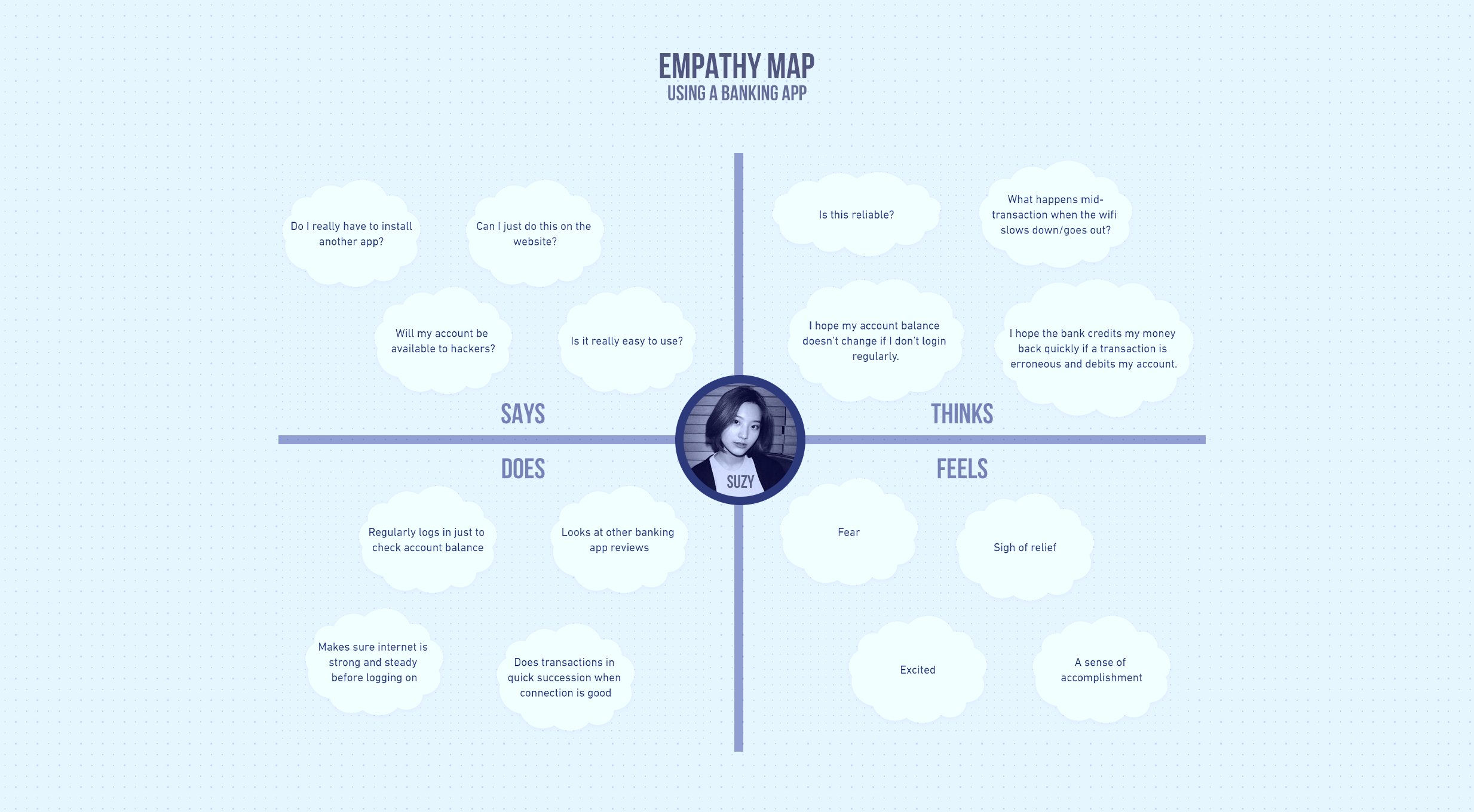
BDO App
Banco de Oro (BDO) is a full-service universal bank in the Philippines. It has the largest distribution network with over 1,300 operating branches and more than 4,000 ATMs nationwide.
I compiled some of my ideas to help improve the BDO Online app.
- Category: Interactive
- Role: Visual Design, UX Design
- When: 2022
- Link: BDO App Prototype (Figma)
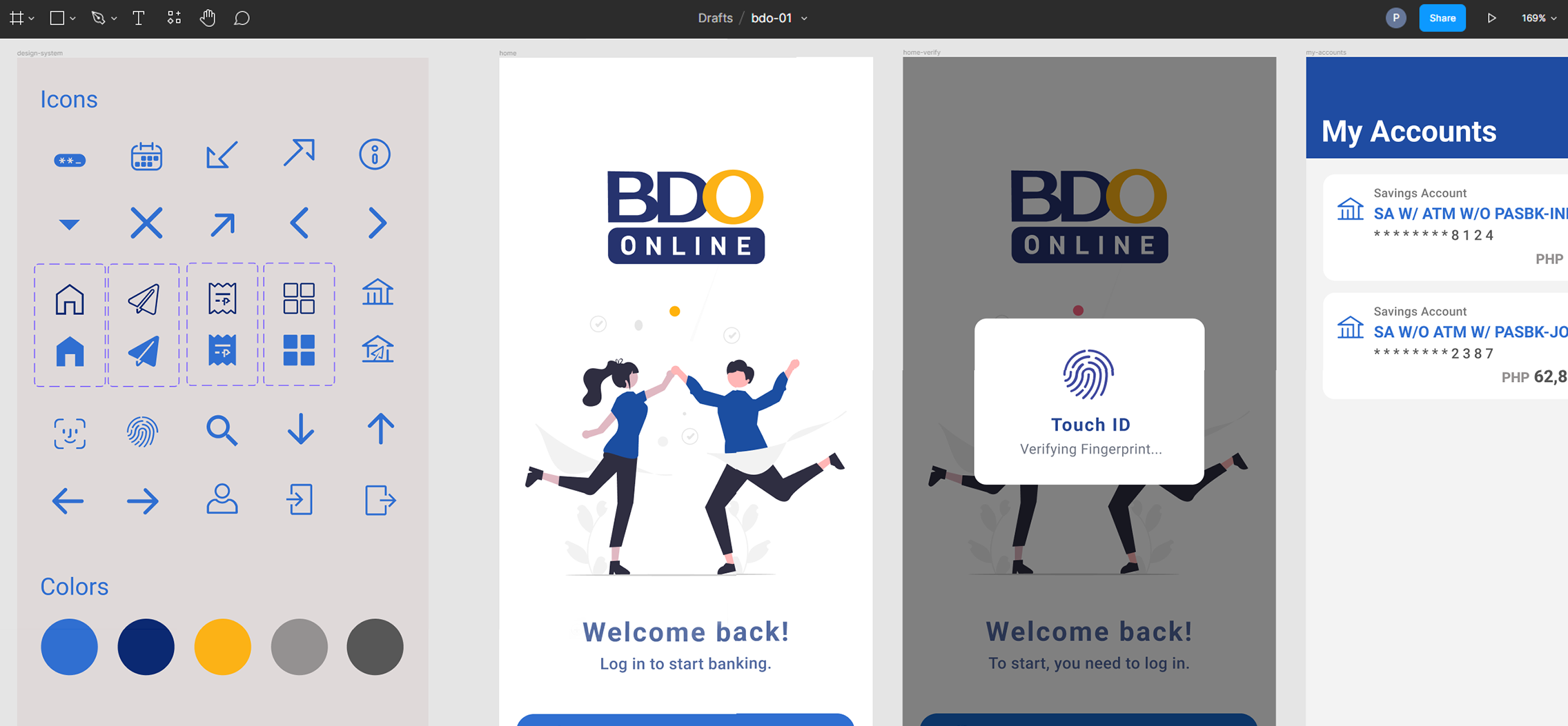
App Logo
There are other BDO apps so maybe this could be used as a framework to lend a bit of consistency to all the app icons under the BDO app "umbrella."" Imagine replacing "ONLINE" with "PAY" or "UNIBANK;" I believe that's not a bad move.
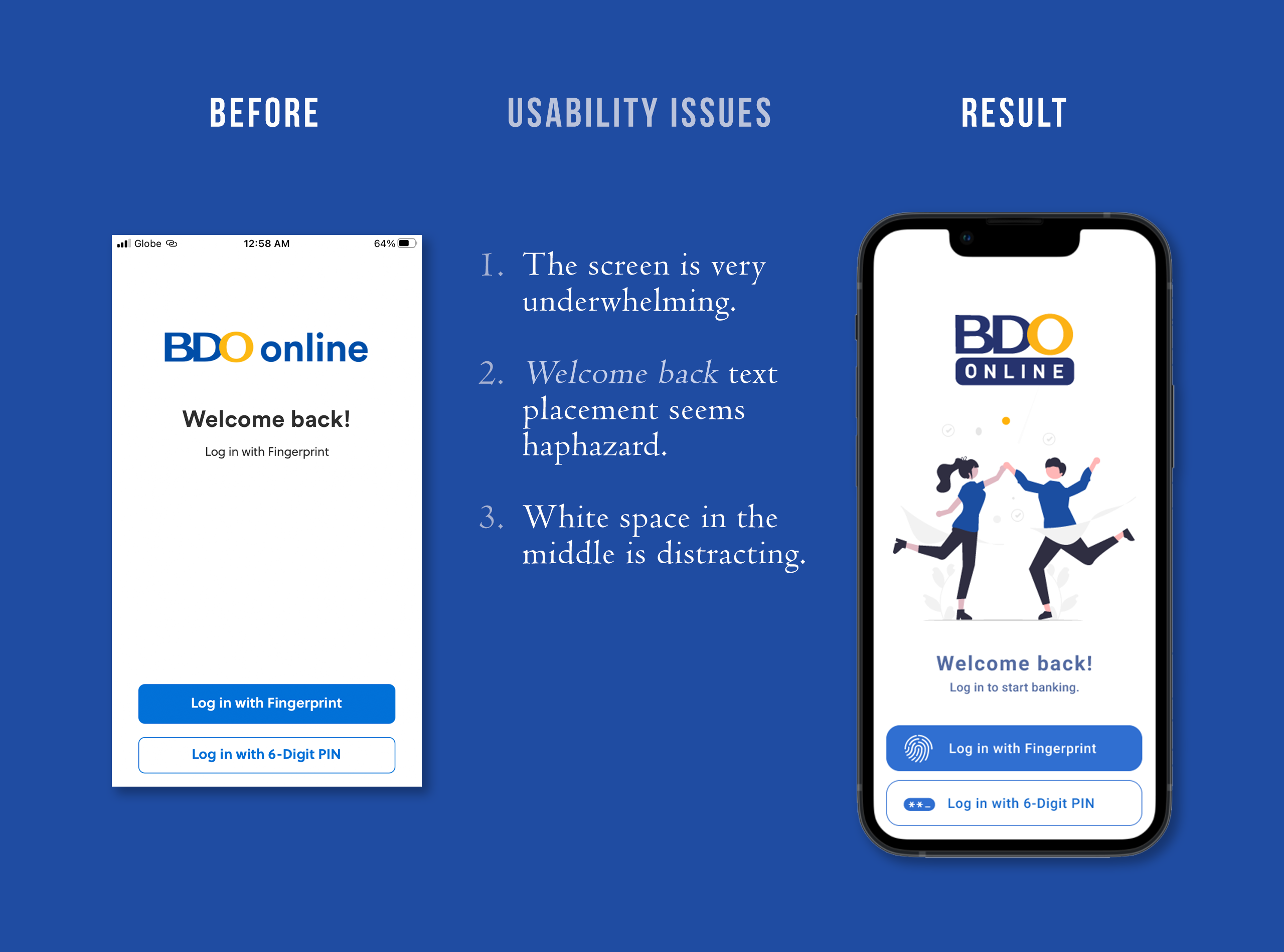
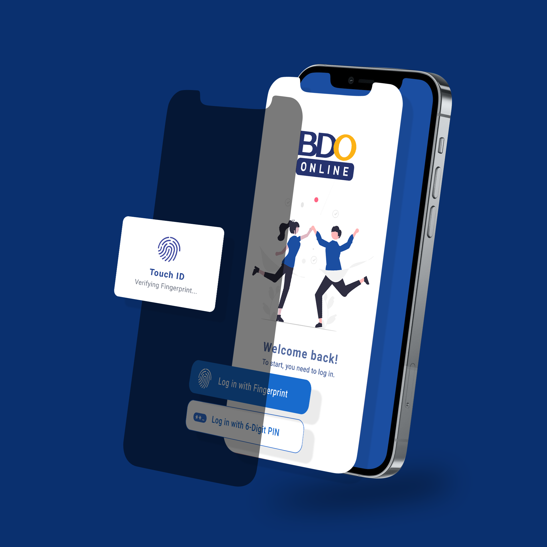
Login Screen Illustration
Added an illustration to the home/login screen to make it feel more welcoming. The app could feature other on-brand illustrations in the same style. Have 4-5 illustrations available then one of them would be displayed randomly whenever the app is launched. Every app update could add or replace with other illustrations. The goal is to delight the user with a touch of humanity.
Also prefixed icons to the button text to help make the buttons more scannable and hopefully lessen cognitive load.
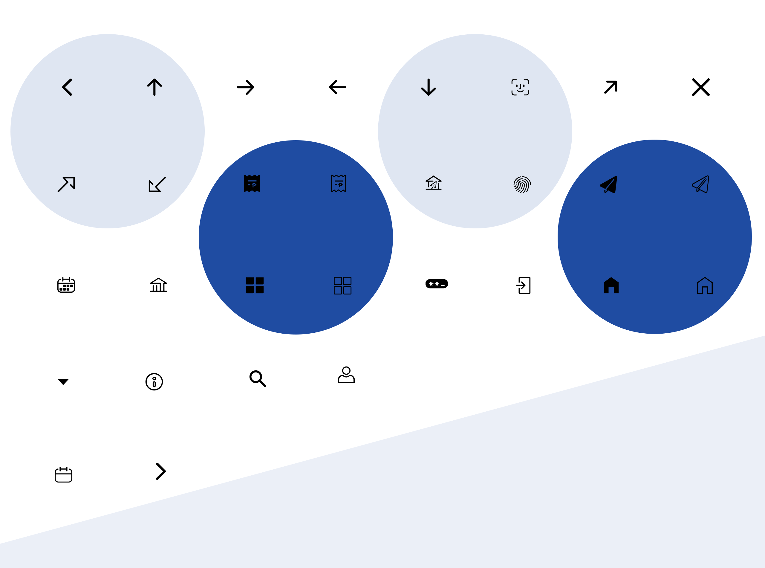
Icons
Designed six new icons and redrew the rest as 24x24 SVGs. I also created filled versions of the navigation icons.
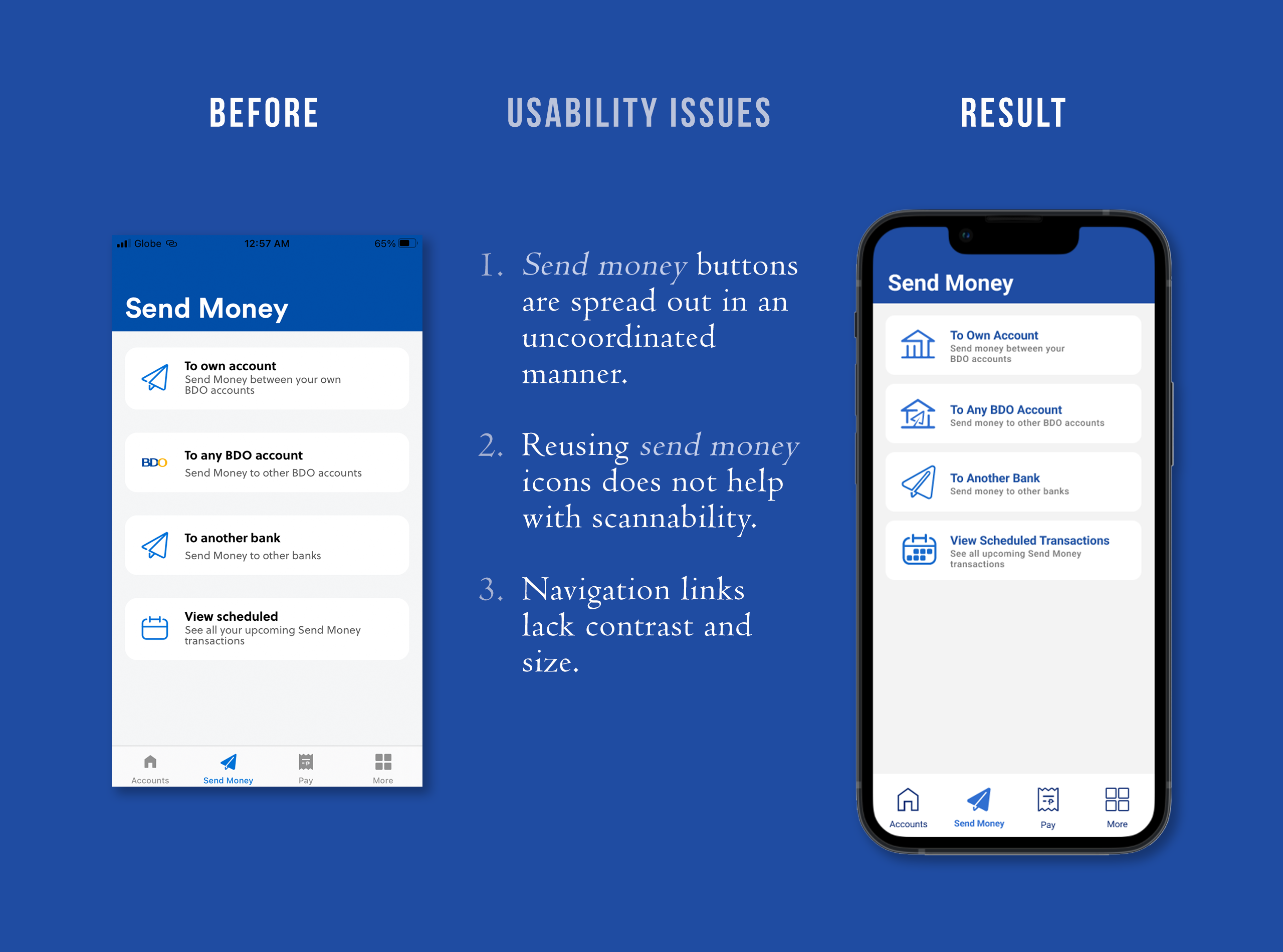
Minor Bits Add Up
Adjusted padding to be a bit more consistent around and between the Send Money options; also replaced the icons and text colors for consistency. Apart from the interface looking nicer and more professional, I feel that it's more satisying to use and easier to trust a well-designed product.
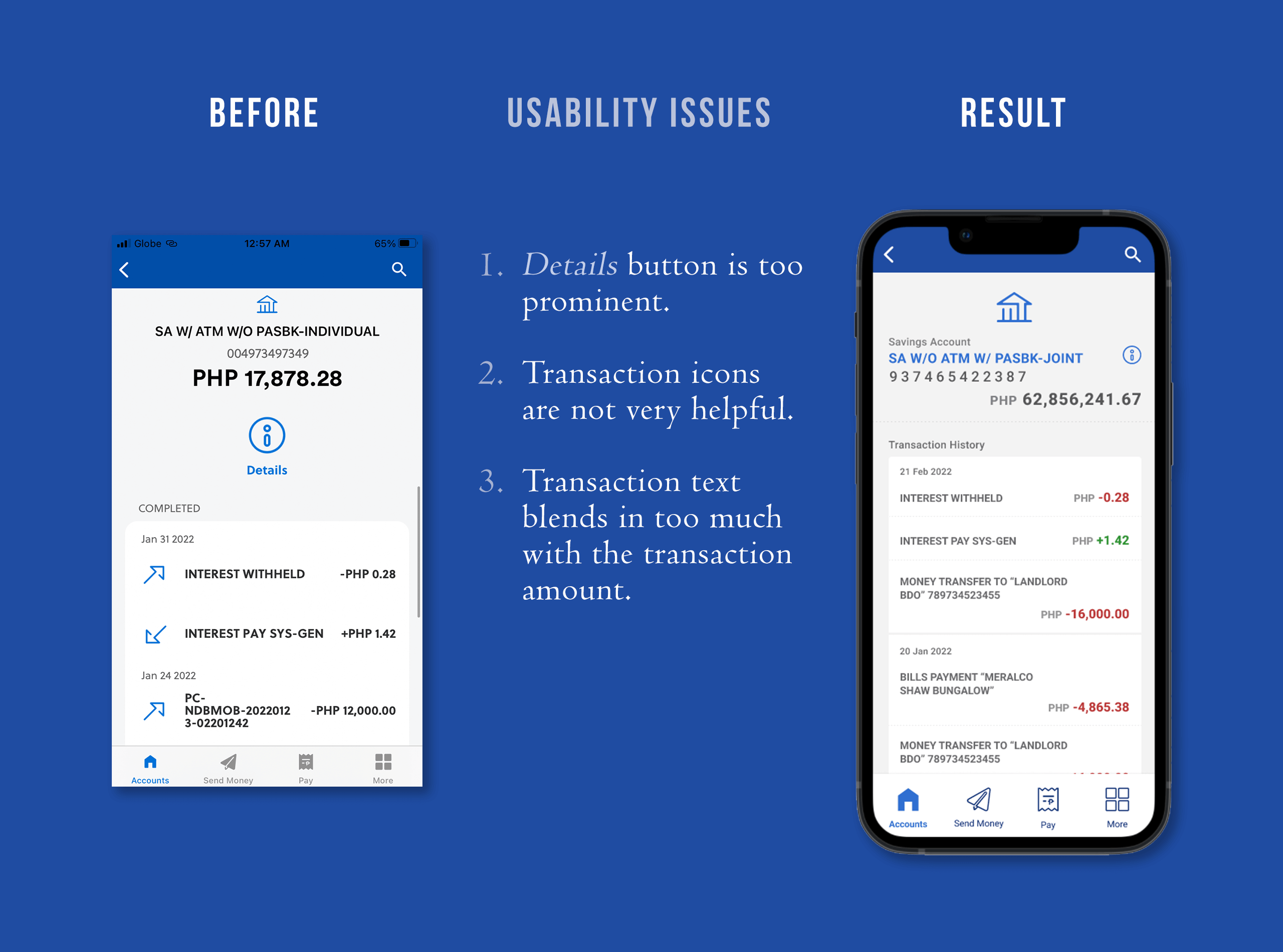
Transaction History
Tweaked the text sizes and alignment to make the account details up top more compact to have more of the recent transactions visible "above the fold." Also added some color to destingiuish debit (red) from credit (green) transactions to improve scannability.
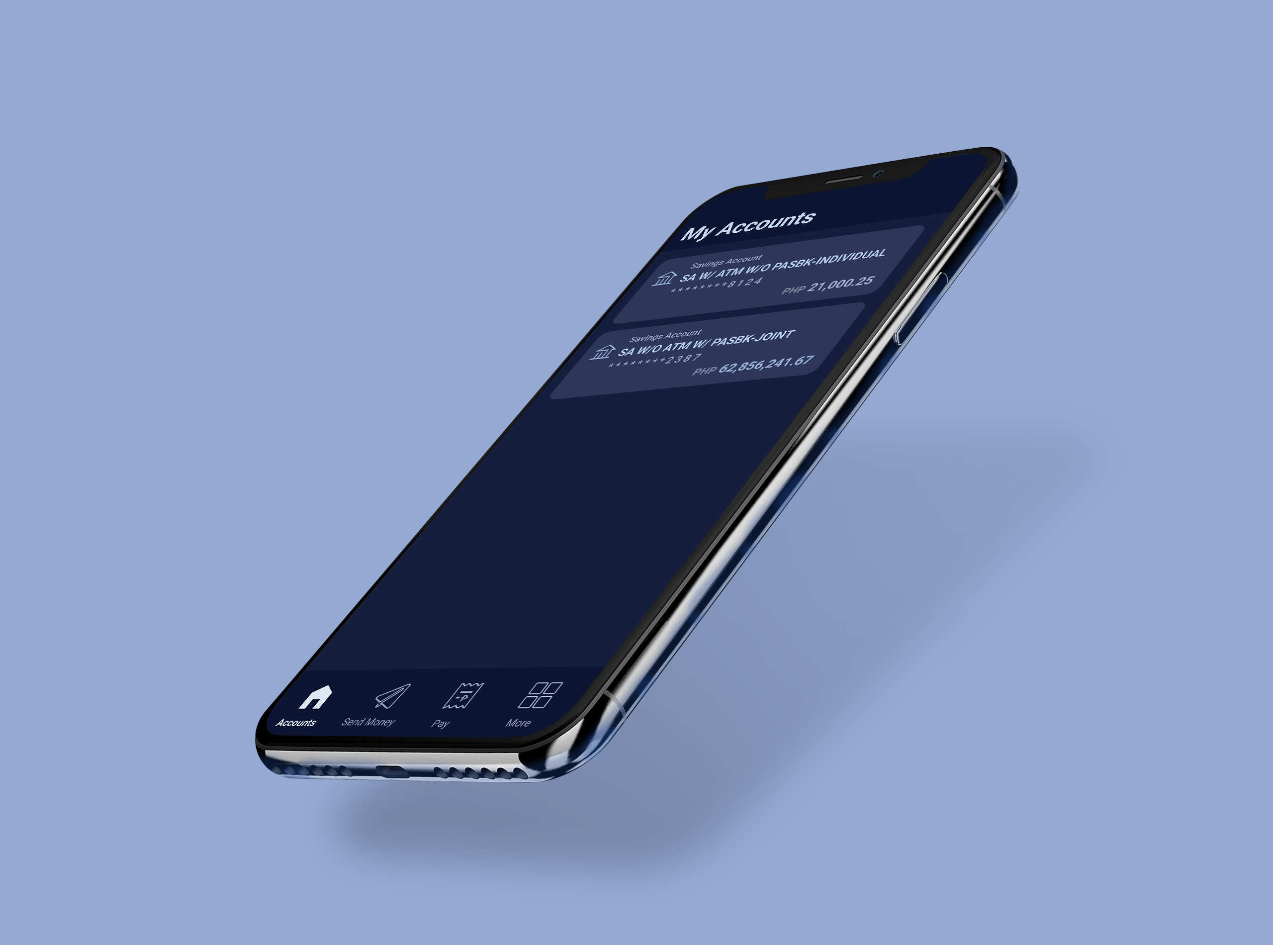
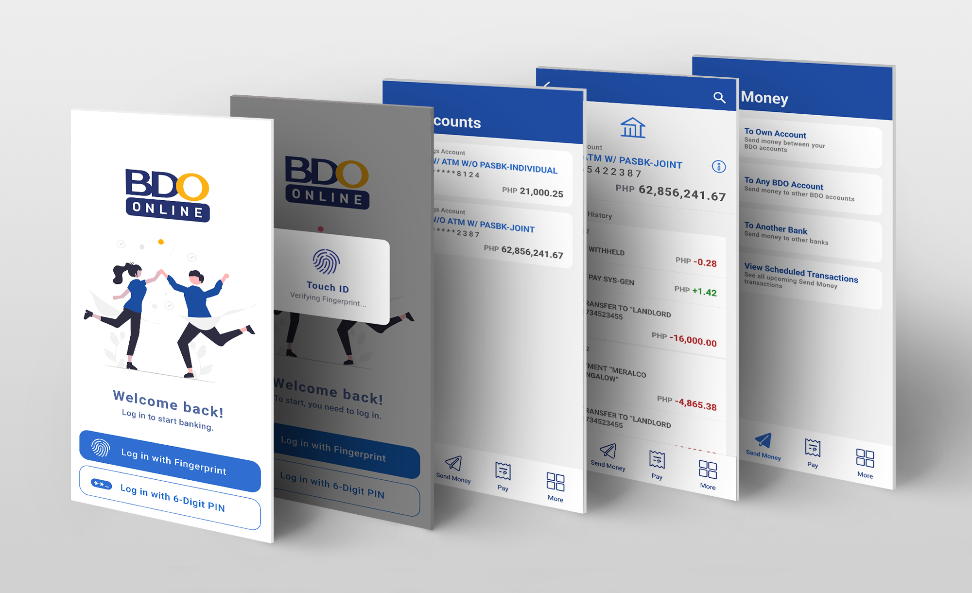
 Various Landing Pages